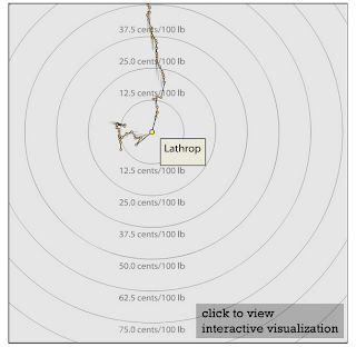
I have never liked history of anything (other than that of technology and business) but I found the visualizations from the Spatial History Project at Stanford informative yet enjoyable. These visualizations have been created by the researchers with publicly available historical data. It is a great attempt to look at history in novel ways. The best way to enjoy the data visualizations experience is to "play" with the interactive ones. More about the project from their website at the bottom of the post. Some of the topics project covers are-
Brief Description of the Project (from homepage)
The Spatial History Project, however, does operate outside normal historical practice in five ways. First, our projects are collaborative. Many of the things that visitors to our web site see involve collaborations between an historian, graduate students and undergraduates, geographers, GIS and visualization specialists, data base architects, and computer scientists. The scholars involved in the Spatial History Project can write books by themselves, but they cannot do a spatial history project on the scale they desire alone: we lack the knowledge, the craft, and ultimately the time. Second, while many of our presentations involve language and texts, our main focus is on visualizations, and by visualizations I mean something more than maps, charts, or pictures. Third, these visualizations overwhelmingly depend on digital history. By digital history all I mean is the use of computers. Digital history allows the exploitation of kinds of evidence and data bases that would be too opaque or too unwieldy to use without computers. It is all the stuff that we cannot narrate, or at least narrate without losing our audience. All historians run across such evidence in the archive. We look at them and toss them aside. For me railroad freight rate tables are the quintessential example. Fourth, these projects are open-ended: everything —both tools and data— becomes part of a scholarly commons to be added to, subtracted from, reworked and recombined. The final, and most critical aspect of our departure from professional norms is our conceptual focus on space.
Also see my earlier post on historical visualizations http://www.infoivy.com/2013/08/part-2-data-visualization-from.htmlhttp://www.infoivy.com/2013/08/part-2-data-visualization-from.html


